Campminder
CampMinder, based in Boulder, Colorado, enhances camp experiences nationwide. The objective was to design a fresh logo and brand identity reflecting their mission and values.
After thorough research and revisions, the final logo embodies adventure, community, and professionalism. Earth tones represent Colorado's beauty, while warm, modern typography invites camps to connect with their resources.
This rebranding signifies CampMinder's dedication to excellence, innovation, and support for the camp community. The result is a versatile logo that boosts visibility and builds trust with camps relying on their expertise. The rebranding process has been deeply rewarding.
Creative Direction / Brand
Early explorations
Tons of options were worked on, more than is shown here, an essential step towards finding something unique that sets this company apart. Most of these options included sacred geometry as a basis for design. This approach not only ensures a harmonious design but also allows for the unexpected surprises that often come from creative exploration.

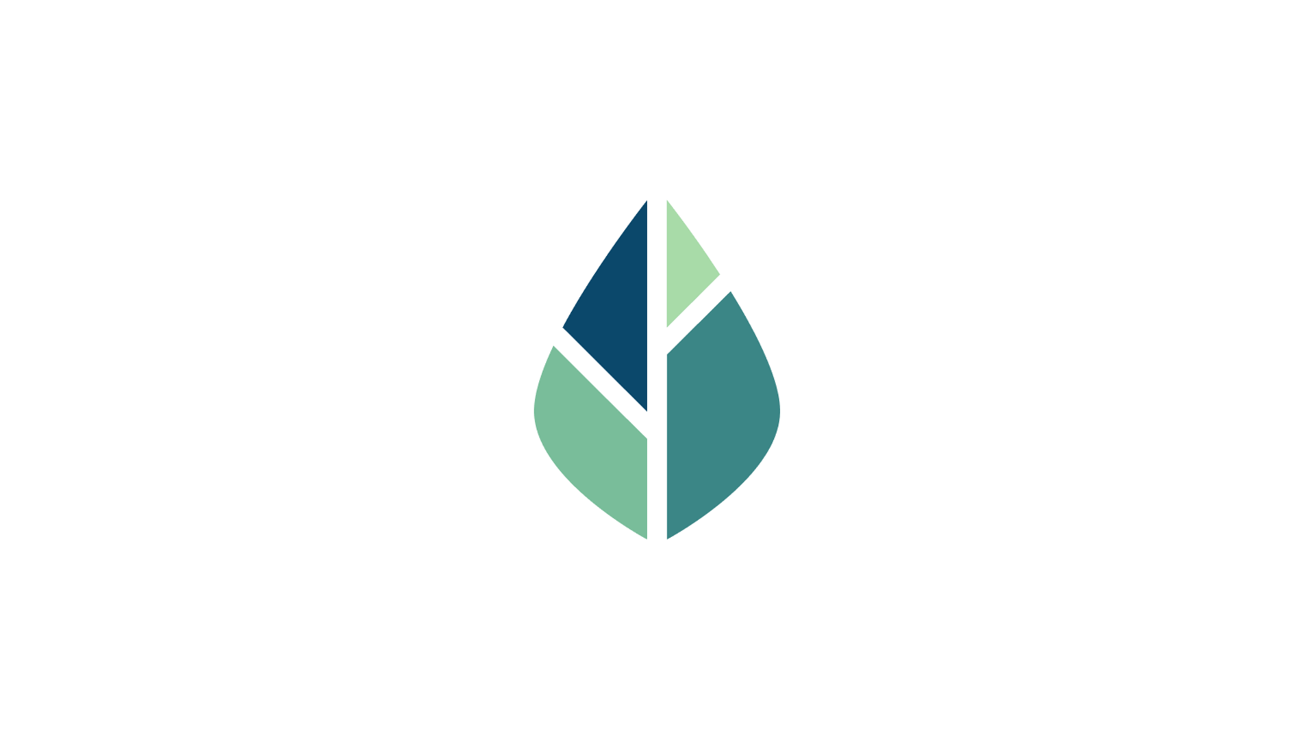
Construction
Below are the essential steps involved in the creation of the logo. Like most things found in the realm of nature, I strive to stick to only the most vital essentials, carefully building from fundamental principles and intricate patterns with a touch of intuition thrown in for good measure.
Design Guidlines
Clear guidelines maintain our brand's identity by defining visual and conceptual elements. We choose colors that connect with nature, like "Mint" and "Sage," evoking emotions tied to experiences and creating deeper connections with users. The color palette is versatile and closely linked to the identity, ensuring they remain recognizable in digital art, prints, and installations. By following these guidelines, we create a lasting brand experience that celebrates nature and innovation, encouraging exploration.


Variations
Keeping the logo fresh, vibrant, and dynamic is absolutely essential for a contemporary, youthful brand. This approach not only enhances the overall aesthetic appeal but also ensures that your digital options remain versatile and open to new possibilities.

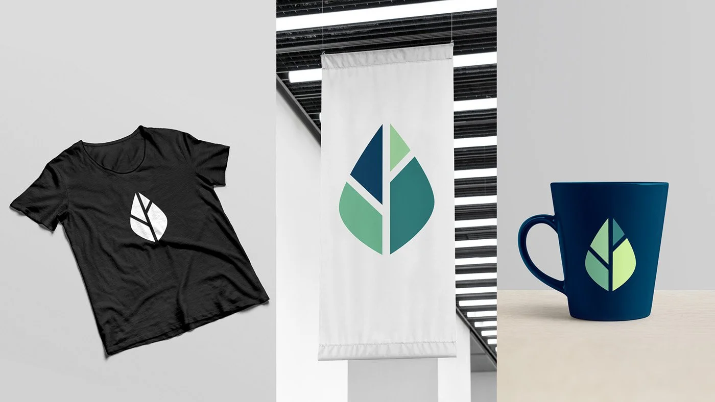
Mocks
Below are various mocks showcasing how the brand can be creatively utilized across multiple mediums and platforms. Each example highlights the unique essence and innovative spirit that defines our approach to elegance.